Saturday, 27 November 2010

Examples of Front Cover

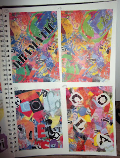
I decided to go ahead and do examples using the front cover images I have collected so far to give examples of what the front cover would look like. I have also given examples of the font colour I could use, but it also depends on the picture, it if is a dark photo then the font needs to be light and the same if the photo was light. 

Also, I was wondering if I need a banner at the bottom of the front cover, does it look like I need one?

1

  
2


Front Cover Photos

These photos were taken back in August when I went on holiday and of other various times, I may be able to get recent photos up soon but if not then I will need to use these (I took them so I don't see any problem using them).

Thank you to my little sister Lucy for allowing me to use these photos of her.

1


2


3


4


5


6


Changed Fonts (Front Cover)

So I looked some more and found better looking fonts, so instead of commenting on the last font front cover post, this is the new one, thanks.


I really like number 4, but I want to know what you guys like as well, thanks.


Font for Contents Title

I am not sure which font to use, just like the front page font for the magazine name. So I need help in choosing one, comment below.


Which font is the best for the Contents Page?
1
2
3
4
5


pollcode.com free polls

Contents page semi-complete (Photos Done)

I have so far added all the photos to the contents page but now I have to make sure the text (font) is alright, I may keep the Comic Sans MS for now but for the 'Contents' title I may change it, it looks a little dull. The next thing I need to do is to take the Front Cover picture and upload it by Monday.


More Contents Page Photos (Edited)

These are the edited versions of the two new contents photos, what do you think? I am now going to complete the contents page and hopefully tomorrow I will have the front cover image to upload.

1


2


3


More Contents Page Photos (Un-Edited)

Took these today, only three new ones, but it was all I could take, hope you like them, I will be uploading the edited versions soon.

1


2


3

Little Blurry 

Friday, 26 November 2010

Front Cover design (Plus Coverlines)

Editing the front cover I took out the Strapline until later, I haven't been able to come up with one at this moment, I am also not sure about the banner at the bottom. Entering some of the coverlines onto the Front Cover as Lures I am hoping to work more on the Front Cover.


Font of Magazine Name

So it looks like Young Ones and Teen-Age is in the lead for the magazine name, so I decided to go ahead and pick some fonts, I will be doing some more soon but right now these just shout out, "Teenage Magazine" to me. Which one do you like more, please comment, thanks.

1

 2
 So just tell me which one you like, not the name but the font, so either 1,2,3,4 or 5. Thanks :D

Contents Design (Updated)

This is the updated version of the contents page both with texts and updated photos, the two missing photos will be added soon.


Contents Photos (EDITED)

1


2


3

New Contents Page Photos (Un-Edited)

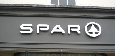
Here are the photos which I was unable to take the first time around, I decided to take a picture of the Town Christmas Tree, it was a spur of the moment shot which I love now, so I have changed the contents text around a little so I can have the Christmas Tree as one of the featured photographs. I finally took a picture of the College enterance gate and also SPAR (see Below)

1


2


3


4


5


6


UPDATE - Fonts and Front Cover

Update on what I now need to do, after talking with my teacher I need to now look at choosing different fonts (the name for the magazine has yet to be chosen but I can still see what the four names would look like if they were in the many fonts. So I need to concentrate on the front cover at this moment, get the Coverlines done, make sure the Strapline is also complete, just get everything ready so when I have the edited front cover image, I am simply place it onto the cover and it will only need a few developments.

I still have yet to take the photos for the contents page but I will be uploading them soon.

Contents Layout Design (With Photos)

I haven't got all of the photos, still have 5 more to take but I should have two of them by the end of today up and edited, hopefully. Over the weekend I am going to be taking the rest of the photos and the front cover photos which I shall edit on Monday or Tuesday (it should be up by then). Tell me what you think of the design (it is Layout 1, which was the winner of the poll) with all of the text put in, some of it may be muddled, I am not sure. More to come soon...


Front Cover Designer (Clean Version)

I've edited it in Coral Paint Shop Pro X, cleaned it up of all those unneccessary lines and now it looks like this, this is of course a rought design like I said before, when it comes to actually designing the front cover it may turn out a little different.


Contents Photos (EDITED)

I selected the ones I liked (Most of them) and got rid of the Avatar DVD (it was too blurry and even using Coral Paint Shop Pro X I couldn't get it clear enough so I scrapped it and decided to stick with the Kick-Ass DVD image. I only needed one of the two anyways so it is easier this way for me).

1


2


3


4


5


6


7


8


9


10


I still have more photos for the contents page to take, such as the photo of Ludlow College enterance Gate and one of SPAR (I am hoping to take these later today and upload them). From the ones I have uploaded and edited, there are multiples of some and so I will need to pick the best ones to put into the contents page (there is not enough room for them all).

For my cover I am hoping on using an actress (younger sister who is 15) to be listening to music and smiling, this will be done over the weekend and I'll be taking minimum around 10 shots just so that I have a lot to choose from. These will be uploaded next week on Tuesday or if not then Wednesday at the latest. From there I will be uploading the editted versions for you so look out for them.

Contents Photos (Un-Edited)


 1


 2


 3


 4


 5


 6


 7


 8


 9


10


11


 12


What do you think? Which ones look the best? Do you have any advice or tips on how I can make them better or what other images I could include?

These are some of the images which I have chosen to maybe be featured in my contents page. They need to be edited still but I may add more and will defiantly be taking some more soon (including my front cover of the teenager).